

Custom Engraved Label Pins Can Lose Fine Text Before Production Begins
A buyer can approve a beautiful screen proof and still receive a pin where the smallest lettering is difficult to read. That is the sourcing risk to catch before issuing a purchase order. On Custom Engraved Label Pins, legibility depends on more than the artwork file. Metal choice, lettering style, engraving method, plating, surface texture, and the final viewing distance all affect the result.
The practical rule is simple: treat small text as a production feature, not a decorative afterthought. A name, serial field, membership title, anniversary date, or safety designation must remain recognizable after engraving and finishing. If the information must be read quickly while worn, simplify it before approving the proof.
Custom Panda has produced pins since 2012 in an 8,000 m² facility with metal die casting production equipment and six production lines. Our ISO 9001:2015 certified and Disney FAMA certified production system uses photo or digital sample confirmation before production. That review stage is where an unreadable fine-text layout should be corrected, rather than discovered in a finished shipment.
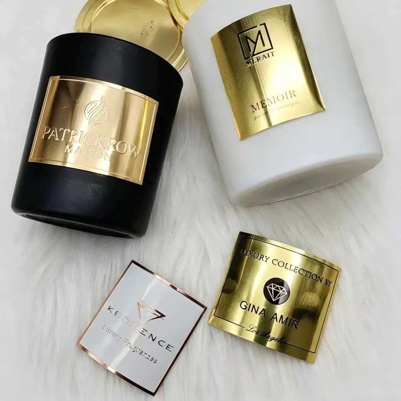
What should buyers decide before requesting an engraved pin quote?
First, decide what the lettering is expected to do. A short role title that identifies staff from nearby has different requirements from a long commemorative inscription intended for close inspection. The conclusion is to rank information by importance, then reserve the clearest area of the pin for the information that cannot be lost.
For branded label pins, start with the label content rather than the logo. If the pin must show a brand name, employee category, award level, and event date, do not assume every element deserves the same engraved treatment. Select one primary text line, one secondary line if necessary, and move less important information to backing cards, packaging, or a related printed item.
| Buyer decision | Recommended choice | Reasoning | When not to use it |
|---|---|---|---|
| Text has operational purpose | Use short, high contrast wording | Fewer characters leave more usable metal around each letter. | Do not shorten regulated wording without your compliance team approving it. |
| Text is commemorative | Use a larger pin face or reduce the inscription | Dates and names compete for the same visible surface. | Do not enlarge the pin if uniform rules or packaging dimensions restrict it. |
| Logo includes tiny type | Use the symbol and brand name only | Taglines and legal lines often become visual noise when engraved. | Keep the full logo only if it remains clear in the approved production sample. |
| Variable names are required | Separate the fixed artwork from the variable field | It helps the buyer check each name list and avoids overcrowding the core design. | Do not use this approach if every pin must carry identical artwork. |
Choose the manufacturing family early as well. custom laser engraved pins suit designs where engraved wording is the feature. For more sculpted relief or a heritage look, premium die struck lapel pins may better suit the artwork. Neither route makes unreadably small copy readable. The artwork must still respect the available face area.
What artwork should be included in the RFQ?
Send the final logo, the exact text, a list of every variable name or number, preferred plating, desired finish, pin backing, quantity, and the intended use. State whether the lettering must be readable at close range or serve as a visual texture. That distinction changes the best recommendation.
If a brand guide specifies colors, include it even when the pin is primarily metal. It helps prevent unnecessary enamel additions that might crowd engraved wording. For a program that also needs product identification or retail packaging, coordinate the pin artwork with custom labels printed in bulk so names, marks, and dates stay consistent across the order.
When do fine engraved letters lose legibility?
Fine engraved lettering loses legibility when the design, material, or finish removes the visual separation needed to identify each letter. The boundary is not one universal size because the answer changes with letterform, word length, pin shape, metal surface, and plating. Buyers should ask for a preproduction review of the actual text rather than relying only on a scaled digital mockup.
| Condition | Why lettering fails | Best response | Boundary or limitation |
|---|---|---|---|
| Very thin letter strokes | Engraving can make narrow strokes look faint or incomplete against reflected metal. | Choose a heavier type style and remove delicate outlines. | A bold typeface cannot compensate for a long message forced into a small area. |
| Condensed uppercase text | Letters such as M, W, A, R, and B can visually close together. | Add spacing, reduce wording, or use a less condensed letterform. | More spacing requires more room and may make a circular layout impractical. |
| Script or decorative lettering | Connected strokes and flourishes can merge after engraving. | Use a plain typeface for functional information. | Script may work for a short brand mark when legibility is secondary. |
| Curved text near an edge | Letters follow a tighter path and lose consistent visual spacing. | Move key wording to a straight central field. | Edge text can remain suitable for short dates or secondary wording. |
| Text beside deep relief | Shadows and changing levels distract from shallow engraved marks. | Place type on a flat, open panel. | Relief may remain appropriate in a separate emblem area. |
| Highly reflective plating | Glare can hide engraved strokes at certain angles. | Consider a subdued finish or stronger text contrast. | A bright finish can still suit display pins viewed under controlled lighting. |
| Antique or textured finishing | Darkening and texture can collect visually around fine strokes. | Use larger, simpler lettering with more open space. | An antique bronze finish is a good fit for broad relief and short wording, not dense copy. |
| Uneven pin silhouette | A narrow area may force the wording into an unsuitable shape. | Add a dedicated nameplate panel or use a simpler outline. | Do not add a panel if it weakens the main logo composition. |
The material affects how the design is built. Zinc alloy pins are useful where a design needs formed shapes or dimensional features, while brass lapel pins can suit refined metal presentations. The correct selection depends on the artwork and finish request, not a claim that one material always produces clearer lettering. Ask the production team to evaluate the actual lettering against the selected material and finish combination.
A polished surface is another common issue. Polished gold plating can look premium and was used for a Canadian esports tournament championship hard enamel pin with dual tone colors. However, a reflective gold field is not automatically the right background for long engraved copy. Where text is essential, the buyer should compare the proof with the intended viewing conditions, including indoor event lighting and everyday wear.
Which pin process fits the label text requirement?
The right process follows the information hierarchy. Choose engraving when the metal itself should carry the message. Choose enamel or printed decoration when color separation or image detail matters more than engraved character depth. The table below gives a procurement starting point, not a substitute for artwork review.
| Process option | Best fit | Text advantage | Main limitation |
|---|---|---|---|
| Laser engraved text | Names, dates, short identification fields | Direct metal marking supports a restrained label pin appearance. | Fine strokes can disappear on reflective or heavily textured finishes. |
| Die struck pins | Formal seals, recognition pins, heritage designs | Raised and recessed metal areas can organize simple wording. | Dense copy still competes with relief details. |
| Hard enamel pins | Corporate logos and color focused awards | Metal lines can separate short wording from enamel fields. | Small enclosed text areas may be unsuitable for enamel filling. |
| Offset printed pins | Artwork with fine visual detail | Printed art can reproduce complex graphics that engraving may not express. | It does not provide the tactile metal effect of engraving. |
| Three dimensional cast pins | Souvenir and sculptural themes | Large relief labels can add character. | Fine wording gets lost when it crosses changing surface levels. |
A real museum example shows the distinction. For a Tokyo exhibition, Custom Panda produced 3D cast metal souvenir lapel pins using antique bronze relief and cut out details to reflect traditional architecture. That treatment fits visual depth and architectural character. It would not be the first choice for a pin requiring several lines of small operational text.
Similarly, a German specialty coffee brand used custom die casting for an interactive spinning enamel pin with a rotating element. Movement added engagement, but any text on a moving component must remain short and positioned so it is not hidden during rotation. Design features can support a message, yet they also consume usable space.
How should a buyer proof text before approving production?
Approve the wording in stages. Do not treat the visual proof as a spelling check only. It is the final opportunity to confirm that the metal process supports the intended use.
- Freeze the copy. Confirm spelling, capitalization, dates, abbreviations, trademarks, and variable data. Late copy changes can alter spacing and the balance of the pin.
- Mark the priority line. Identify the one line that must be immediately readable. Place it on the clearest, flattest area of the design.
- Remove low value copy. Delete slogans, web addresses, and repeated brand names when the logo already communicates the brand.
- Check letter relationships. Look for characters that touch, narrow gaps between lines, and words that follow a tight curve. These are common sources of visual merging.
- Review the selected finish. Compare the proof against the chosen plating and texture. A text layout acceptable on a matte-looking digital image may behave differently on polished metal.
- Approve a photo or digital sample. Custom Panda provides photo or digital sample confirmation before production. Use it to ask direct questions about the smallest text, not only the overall appearance.
- Keep a signed specification record. Attach the approved proof to the purchase order, including finish, backing, quantity, and packaging requirements.
For standard pins, patches, and labels, the stated sample lead time is 3 days, while bulk production is listed at 8 to 9 days. Allow that review time in the campaign schedule. Rushing approval is a poor trade when the pin will be used for a long running membership or employee recognition program.
What common ordering mistakes make engraved wording unreadable?
- Copying a business card layout onto a pin. A pin face has far less room. Use the logo and one clear identifier; place addresses, phone numbers, and long claims elsewhere.
- Approving text at enlarged screen scale. Zoomed artwork can conceal spacing issues. Ask to see the design represented at its intended physical use scale.
- Choosing finish before checking contrast. A buyer may choose antique treatment or bright plating for appearance, then learn it obscures the label. Review wording and finish together.
- Putting text across multiple levels. Relief, cutouts, and curved surfaces create changing light. Keep functional text on one consistent field.
- Using decorative fonts for staff identification. The pin may look artistic but fail its purpose. Use decorative lettering only for short, nonessential marks.
- Assuming enamel fixes small copy. Enamel adds color but does not create unlimited room for letters. It can make crowded text less clear if separations become too tight.
- Skipping the defect policy discussion. Confirm what happens if approved specifications are not met. Custom Panda offers color mismatch free reprint, proportional replacement for defects, and 5 day fast re stocking or repair.
Frequently asked questions about engraved label pin specifications
Can an engraved pin include a logo and several lines of text?
Yes, if the artwork gives each element a defined role. Use the logo as the visual anchor, place the primary label on a flat area, and reduce secondary copy. It is not suitable to force several long lines into a compact logo shape simply because all information appears in a brand guide.
Is engraving better than enamel for branded name pins?
Engraving is better when the desired result is a metal forward label with short, stable wording. Enamel is better when color coding, bold logo fields, or visual recognition is the main requirement. For complex illustrations or image based artwork, offset printing may be a more suitable route. The process should follow the use case, not fashion.
Can antique finishes make text easier to see?
They can add visual separation in broad recessed features, but they can also make fine marks appear busy. Use antique treatment for short labels and bolder relief. Do not rely on it to rescue thin, crowded lettering.
What quality checks should be requested?
Request a review of spelling, line breaks, placement, finish, backing stability, and the smallest engraved details. Custom Panda includes 100 bonus pieces with every bulk order and can provide proportional replacement for defects. These safeguards support production quality, but the buyer still needs to approve a clear, production appropriate artwork file.
Should membership pins use engraved wording?
Engraved membership pins are a strong option when the membership name, level, or anniversary year is short and needs a formal metal appearance. They are less suitable when each pin must include lengthy personal data. In that case, simplify the pin and use a printed card or accompanying label for variable information.
Send your artwork, required wording, preferred finish, and target quantity for a practical preproduction review and quote.
===