

Custom Leather Patches Prevent Fine Logo Detail Loss Before Production
A logo can look sharp on a screen and still fail when converted into a physical patch. Buyers often regret approving artwork before checking whether tiny text, hairline borders, faint icons, or low contrast elements will remain visible after engraving. For Custom Leather Patches, that gap between digital artwork and the finished surface is where costly rework begins.
The safe approach is simple: assess the logo for production limits before approving the proof, then adjust the artwork only where physical engraving requires it. A patch should preserve the parts of a brand mark that customers recognize first: its name, primary shape, key symbol, and visual hierarchy. Decorative micro details come last.
At Custom Panda, photo or digital sample confirmation is part of the production process before bulk production. This matters because the proof is not only a spelling check. It is the point where buyers can identify detail loss, weak contrast, unsuitable placement, and edge problems while changes are still practical.
Choose the patch method around the logo, not the other way around
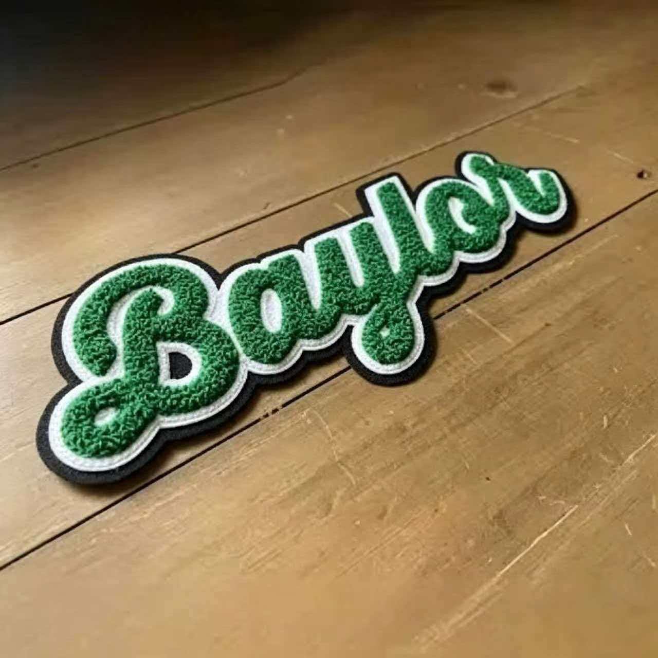
Start with the visual effect your brand needs, then test whether the supplied artwork supports it. Laser engraving, embossing, debossing, and color printing each communicate a logo differently. The best choice depends on how much information the mark contains, where the patch will be applied, and whether the patch must match other branded items.
| Patch method | Best fit | Why it works | When it does not fit |
|---|---|---|---|
| Laser engraving | Bold logos, simple icon marks, short brand names | Creates a tonal mark through surface contrast without relying on printed ink colors. | Not the first choice for faint tonal artwork, tiny legal copy, or logos built from many delicate lines. |
| Embossed or debossed design | Heritage marks, monograms, simple borders, premium denim details | Relief creates a tactile result that suits logos with clear shapes and controlled spacing. | Not suitable when small lettering or dense illustration must be read at a glance. |
| Color printed design | Logos with multiple brand colors, fine illustration, or detailed graphics | Preserves more visual information than a single-tone engraved result. | It may not suit a buyer seeking a restrained, natural leather appearance. |
| Embroidered patch | Thread-based apparel branding and larger artwork | Offers a textile finish that can suit uniforms, jackets, and accessories. | It is not a direct substitute when the collection requires a leather surface or engraved effect. |
Recommendation: choose laser engraving when the logo can be reduced to its most recognizable shapes without losing its identity. Choose color printing when exact color relationships and fine illustration are non-negotiable. Choose raised or recessed effects for a simpler mark where texture is part of the desired product feel.
For example, a mountain outfitter with a broad mountain silhouette, a short name, and a wide border is a strong candidate for leather hat patches. A cosmetic brand with a script wordmark, botanical drawing, and multiple color accents should consider a color printed approach instead. Trying to force both designs into the same method usually produces a compromise.
Italy provides a useful real production reference. Custom Panda supplied embossed faux-leather patches for a premium denim line, using custom debossed logos and antique edges designed to withstand industrial stonewashing and heavy daily wear. That type of result fits a bold, established logo with enough open space for a debossed impression; it is not evidence that every highly detailed logo should be embossed.
For patch categories that use thread rather than leather, review custom embroidery patches before finalizing the production route. The artwork review should be method-specific from the start.
Prepare artwork that survives physical reproduction
The production file should communicate intent clearly. A supplier cannot reliably infer whether a nearly invisible line is a deliberate design feature, a file export problem, or an unintended artifact. Before sending an RFQ, prepare one master artwork file and one reference image that shows the intended finished look.
Use a hierarchy that remains recognizable
Keep the core brand elements visually dominant. This means the brand name, icon, or emblem should receive more space than supporting copy, founding dates, web addresses, or social handles. When a patch is small, the viewer cannot absorb every detail from a full corporate logo. A simplified production version is often the better brand decision.
- Retain: the logo silhouette, primary icon, main wordmark, and major interior shapes.
- Review: thin interior borders, tiny stars, dense hatching, repeated micro patterns, and narrow gaps.
- Remove or enlarge: taglines, registration symbols, small web addresses, and decorative copy that cannot be read on the intended patch size.
- Separate: overlapping shapes that rely on minor shade changes rather than clear boundaries.
A common mistake is submitting a website header logo without adapting it for a physical item. A horizontal logo designed for a wide digital banner may become cramped on a small rectangular patch. The fix is not automatically to shrink it. Instead, ask for a stacked lockup, a symbol-only patch, or a simpler wordmark treatment.
Send source files and production notes together
Vector artwork is preferred when available because it provides clear shape data for artwork review. If only a raster file exists, submit the cleanest original available rather than a screenshot taken from a website or social post. Include the intended patch shape, desired attachment method, garment or product location, and whether the design must align with existing packaging or merchandise.
For a complete brand presentation, a denim or cap program may also use custom woven clothing labels for inside garment information. The leather patch can then focus on the outward-facing logo rather than carrying care text, size information, or other dense content.
Production boundary FAQ for laser engraved artwork
This FAQ addresses the production boundary buyers need to understand before approving laser engraved patches. Laser engraving does not reproduce artwork in the same way that a digital screen displays it. It converts the design into a physical tonal effect on the patch surface. Material color, artwork contrast, logo scale, and the relationship between positive and negative space all affect what remains visible.
Will very small text engrave clearly?
Direct answer: not always. Very small text can fill in, soften, or become difficult to read after engraving, particularly when letterforms have thin strokes, tight spacing, or ornate serif details.
What to do: enlarge the text, increase spacing between letters, switch to a simpler font, or remove nonessential text. Keep the main brand name and move legal copy or a slogan to a separate label, hang tag, or packaging component.
When this advice does not apply: if text is not intended to be read and functions only as a texture element, it may remain acceptable. State that intention on the proof so the design team evaluates it as a visual pattern rather than a readability requirement.
Can thin lines remain separate?
Direct answer: thin lines can fail when they are too close to adjacent lines, when they form narrow gaps, or when they depend on tiny breaks to define an illustration. The engraved result may make separate elements appear joined or reduce the apparent gap between them.
What to do: convert hairline strokes into thicker shapes, widen open gaps, and simplify repeating details. A leaf illustration, for instance, may keep its outer contour and central vein while dropping minor vein marks. The resulting patch often reads better from normal viewing distance.
When this advice does not apply: if the patch is intended to feature a large, simple illustration with generous open areas, detailed linework may be workable after review. Do not assume that a large artwork file alone solves the issue; the finished patch dimensions and layout still control the result.
Why does low contrast artwork disappear?
Direct answer: engraving needs visible tonal separation between marked and unmarked areas. Artwork built from slight shade differences may lose distinction because the physical result does not preserve subtle digital gradients or near-matching tones in the same way.
What to do: turn soft tonal differences into clear light and dark shapes. Replace a faint gray border with a stronger shape boundary. Replace a photographic texture with a simplified silhouette. If exact multi-color artwork is required, select a color printed treatment instead of relying on engraving.
When this advice does not apply: low contrast can be an intentional aesthetic choice for a quiet, understated mark. In that case, request a proof that shows the expected visibility and approve it only if the subtle effect is acceptable for the end use.
How do proof revisions prevent detail loss?
Direct answer: proof revisions let the buyer compare the original artwork against a production-ready version before bulk work starts. The revision should identify what changed, not merely present a new image without explanation.
| Proof check | Buyer action | Reason |
|---|---|---|
| Brand name | Read it at the intended viewing scale and check every character. | Small letter changes are easy to miss after the design becomes physical. |
| Fine line detail | Ask which lines were thickened, joined, or removed. | You can determine whether the simplified mark still meets brand standards. |
| Contrast | Confirm that engraved and unengraved areas remain visually distinct. | Low contrast is a frequent cause of weak logo recognition. |
| Patch outline | Check clearance between artwork and the edge. | Artwork crowded against the edge can look unbalanced or lose definition. |
| Attachment area | Confirm where the patch will be sewn, applied, or attached. | Placement affects whether the logo sits flat and remains visible in use. |
At Custom Panda, buyers receive photo or digital sample confirmation before production. Use that stage actively. Mark requested changes directly on the proof, identify the artwork version by file name, and keep one internal approver responsible for the final signoff. This prevents conflicting comments from marketing, sourcing, and product teams.
Build an approval workflow that protects the first order
A clear workflow protects both the brand and the production schedule. It also reduces the risk of approving an attractive proof that does not answer the practical questions: Is the wording readable? Does the logo retain its recognizable form? Is the attachment suitable for the finished product?
- Define the end use. Identify whether the patch is for hats, jeans, bags, outerwear, or retail packaging. The application controls shape, placement, and attachment requirements.
- Select the logo version. Use the primary mark only if it has enough open space. Otherwise prepare a simplified secondary logo version for physical branding.
- Choose the decoration method. Match laser engraving, color printing, or embossing to the amount of detail and color accuracy required.
- Submit artwork and reference notes. Provide source art, target patch shape, intended placement, and any non-negotiable brand features.
- Review the production proof. Check spelling, contrast, line separation, edge clearance, and whether every required element remains visible.
- Request revisions before approval. Ask for changes in one consolidated response. Do not treat the proof as a formality.
- Approve the confirmed version. Archive the approved file and notes so repeat orders use the same reference.
Our ISO 9001:2015 certified facility operates six production lines in an 8,000 m² facility established in 2012. For qualifying patch and label projects, sample lead time is listed as 3 days, while bulk production is listed as 8 to 9 days. Timelines should be discussed against the actual artwork, order scope, revision cycle, and shipping destination; proof revisions are valuable, but they should be planned before a launch deadline becomes urgent.
Buyers placing an initial order should also ask how defects are handled. Custom Panda provides a color mismatch free reprint, proportional replacement for defects, and 5-day fast re-stocking or repair according to the stated terms. These measures support order recovery, but they do not replace careful artwork approval before production.
Match detail level to the product application
The patch application changes what “good detail” means. A logo on a cap front is usually viewed from a short distance. A patch on denim may be seen up close at retail, but it must also remain recognizable after wear and washing. A small brand tab on a bag often needs a bold icon more than a full wordmark.
| Application | Recommended artwork direction | Primary limit to review |
|---|---|---|
| Caps and hats | Use a bold icon or short name with a clean outer border. | Dense artwork can become hard to recognize on a small visible area. |
| Denim and workwear | Use a strong emblem, monogram, or debossed logo with open spacing. | Fine copy may add little value after normal wear. |
| Bags and outdoor gear | Prioritize immediate recognition and clear contrast. | Placement on curved or flexible surfaces can affect appearance. |
| Retail accessories | Use color printed artwork when exact brand colors carry the design. | Engraving is not the best route for multi-tone graphics requiring precise color matching. |
If a collection needs a different physical texture or a raised molded appearance, compare custom pvc patches as well. They are a separate product direction, not a repair for an overly detailed engraved logo. The decision should still begin with the artwork and use environment.
For brands needing a natural retail presentation, custom kraft labels can support the same understated look on packaging, while the patch carries the simplified product mark. This division keeps each item focused on what it can communicate clearly.
Use this buyer checklist before releasing production
- Does the selected logo remain recognizable without its smallest decorative details?
- Can every required word be read at the intended patch size?
- Are thin lines and narrow gaps necessary to brand recognition, or can they be simplified?
- Does the artwork depend on subtle shade changes that engraving may not show clearly?
- Have you chosen the correct method for exact color requirements?
- Is there enough clear space between the logo and patch edge?
- Have all stakeholders approved the same proof version?
- Have you recorded the intended placement and attachment method for production?
- Does the proof identify any line, text, or contrast changes made for manufacturing?
- Will the patch still match related apparel branding patches, labels, and packaging materials?
Submit your artwork and intended patch application for a production-focused proof review before placing your first order.