

How to Ensure Your Custom Metal Label Pins Have Crisp, Legible Text
Approving a digital proof for your order feels final, but it's where the most expensive mistakes are born. A design that looks perfect on-screen can become an unreadable blur of metal once it is die-struck and plated. The biggest culprit? Text and fine details that fall below manufacturing tolerances. Getting this wrong leads to rework, delays, and a product that fails to represent your brand with clarity.
As a consultant who has spent over a decade on the factory floor, I've seen countless designs with tiny, intricate text get rejected—or worse, produced with disappointing results. The key to success is understanding the physical limitations of metalwork before you commit to a design. This guide will walk you through the technical checkpoints for creating sharp, legible Custom Metal Label Pins that look as good in hand as they do on your monitor.
Choosing the Right Pin Type for Text-Heavy Designs
Not all pin styles handle text equally. The manufacturing process itself dictates the level of detail you can achieve. Before you get attached to a specific look, consider how your text will be rendered. Your choice here is the first and most important step toward legibility.
For instance, our work on 3D cast metal pins for a Tokyo museum exhibition required deep antique bronze relief to capture architectural details, a process well-suited for larger, stylized elements but not for fine print. Making the right choice upfront saves significant time on revisions.
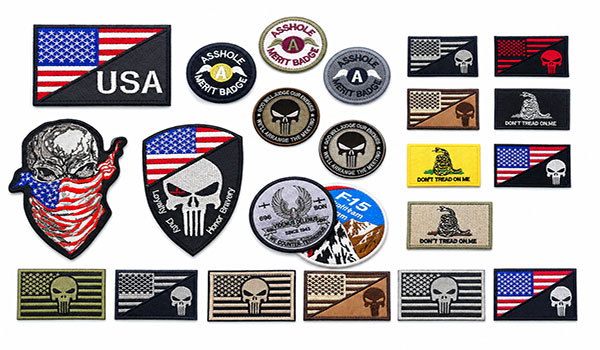
Here is a breakdown of the most common pin types and their suitability for designs that rely on text.
| Pin Type | How It Handles Text | Best For | Limitations |
|---|---|---|---|
| Soft Enamel | Raised metal lines create channels that are filled with colored enamel. The recessed color provides good contrast against the metal outlines. | Logos and stylized text where the metal borders are a key part of the design. | The need for metal borders means very small text can become "filled in" if the letters are too close together. |
| Hard Enamel | Enamel is filled to the same level as the metal lines and then polished flat, creating a smooth, jewelry-like surface. This offers excellent contrast and a premium feel. | Corporate logos and designs requiring a clean, high-end finish. The flat surface makes text very easy to read. | Slightly higher cost than soft enamel. Requires clear separation between color areas. |
| Die Struck (No Enamel) | The design is created entirely from raised and recessed metal. Readability depends solely on shadows and highlights. | Designs with bold, large text or logos where a classic, metallic look is desired. Works best with antique finishes. | Fine text is very difficult to read, especially with polished plating that creates glare. Not suitable for small print. |
| Offset Printed | Your design is digitally printed directly onto a metal base and then sealed with an epoxy dome. This method reproduces exact details. | Designs with complex color gradients, photographs, or very small, fine text that cannot be die-struck. | Lacks the dimensional, metallic texture of enamel or die-struck pins. The epoxy dome can be prone to scratching without proper care. |
Avoiding Unreadable Details: A Pre-Proofing Technical Checklist
Once you've selected a pin type, the next step is to examine your artwork for technical red flags. A digital proof is your last chance to catch issues that can render text illegible. At our ISO 9001:2015 certified facility, we check for these issues, but knowing what to look for empowers you to create a better initial design. Our free design assistance service can help you identify and fix these problems before they delay production.
Here are the three most common causes of unreadable text and how to address them before approving your proof.
Common Legibility Failures and How to Fix Them
-
The Problem: Blurry or "Filled-In" Text.
This happens when the raised metal lines in your design are too thin (low line weight) or the spaces between them are too narrow. During die-striking, the metal cannot form such a fine detail, and during plating, the thin layer of metal can bridge the tiny gaps, turning letters like 'e' or 'a' into solid blobs.
The Fix: For any die-struck elements (the metal lines in enamel pins or all details in die-struck pins), ensure your artwork uses a minimum line weight of 0.2mm. For text, choose a clean, sans-serif font and add a small stroke (outline) to it in your design program to thicken the letterforms. Avoid script or serif fonts for any text smaller than 7 points.
-
The Problem: Low-Contrast, Hard-to-Read Text.
This is most common on die-struck pins with no enamel fill. If you choose a high-polish plating (like polished gold or nickel) for a design with raised text, the shiny surface reflects light, creating glare that makes the text nearly invisible from certain angles.
The Fix: The best solution is to choose a plating with built-in contrast. Antique platings (bronze, silver, or gold) are ideal, as the chemical process darkens the recessed areas, making the raised text stand out. Matte platings also work well by reducing glare. If you must use a polished finish, consider making the text recessed and filling it with a dark enamel color, like on the premium hard enamel pins for brands we produce.
-
The Problem: Weak or Broken Letterforms.
This occurs when parts of a letter are too thin to be structurally sound. The thin crossbar on a capital 'H' or the delicate curves on a 'S' can break during the polishing process or with regular wear and tear if they are not thick enough.
The Fix: Review every letter in your design. If any part looks exceptionally thin, either choose a bolder font or manually increase the thickness of that specific area. This is especially important for pins with cut-outs inside or around the text.
How Metal Plating Affects Text and Fine Line Readability
The final plating finish is more than just a color choice; it directly impacts how light interacts with your pin's surface. The right plating can enhance detail, while the wrong one can obscure it entirely.
For example, a Canadian esports tournament client needed custom hard enamel lapel pins with polished gold plating. This worked perfectly because the design featured large text and logos filled with vibrant, contrasting enamel. The polished metal framed the colors, creating a sharp look. However, if that same pin had been die-struck with small, raised text and no enamel, the polished finish would have made it difficult to read.
Consider these options:
- High Polish Finishes (Gold, Silver, Nickel): Offer a bright, reflective surface. Best used to create a border around recessed, color-filled areas. Avoid using them for designs that rely on fine, raised metal text.
- Antique Finishes (Bronze, Silver, Gold): The best choice for pure die-struck pins. The antiquing solution settles into recessed areas, creating a dark background that makes raised details pop with exceptional clarity.
- Matte Finishes (Matte Gold, Matte Silver): A great compromise. These platings have a satin-like, non-reflective surface that minimizes glare, making raised metal details easier to see than with high-polish alternatives.
- Black Plating (Black Nickel or Dyed Black): Provides maximum contrast for enamel colors. Black nickel has a shiny, gunmetal appearance, while dyed black is a true, deep matte black. Both make colors appear more brilliant.
Material Selection for Durability and Detail
The base metal of your pin affects its weight, perceived value, and ability to hold fine detail. Our production lines are equipped to handle several materials, each suited for different applications.
Zinc Alloy: This is the go-to material for 3D or die-cast pins and those with complex cut-outs. Since it is injected into a mold as a liquid, it can capture complex, multi-layered details. We used this for a German coffee brand's interactive spinning enamel pins, where the custom die-cast parts needed to be both intricate and durable for the spinning mechanism to work smoothly.
Brass: A heavier, more premium material than zinc alloy or iron. It is stamped from a solid sheet, which results in exceptionally crisp and clean lines. It's the standard for high-quality custom enamel pins for promotional campaigns & branding and official insignia.
Iron: A cost-effective and durable option, iron is also stamped like brass. It is the most common choice for soft enamel pins, especially for large-volume orders where budget is a key consideration. While it holds detail well, it is slightly less sharp than brass.
Your choice of material is often guided by the pin style and design complexity, but it’s a factor worth discussing with your manufacturer to ensure the final product meets your expectations for both detail and durability.
Our Quality Guarantees: What Happens If Details Are Missed
Even with careful planning, production issues can arise. That is why it is important to work with a manufacturer that stands behind its product. Before any bulk production begins, we provide a photo or digital sample for your final confirmation, giving you a clear picture of the finished product.
We believe in full accountability. If your pins arrive and the colors don't match your approved proof, we offer a free reprint. For any pieces with manufacturing defects, we provide a proportional replacement to ensure you receive the full quantity you paid for. We also include 100 bonus pieces with every bulk order, giving you extra units at no additional cost.
Our commitment to quality is backed by our Disney FAMA and ISO 9001:2015 certifications, ensuring every step of our process—from material sourcing to final inspection—is held to an international standard of excellence. With a fast 5-day re-stocking and repair service, we work quickly to resolve any issues.
Getting the details right on your custom pins is a matter of combining good design with manufacturing knowledge. If you're unsure whether your design's text will translate well to metal, submit your artwork for a free design review with our specialists.