

Custom Wine Labels Cut Costs When Roll and Finish Specs Match the Job
The most expensive wine label is often not the one with the highest quoted unit price. It is the label that does not fit the applicator, uses a finish that the bottle does not need, or forces a costly reprint after the first production run. Before approving an RFQ, a wine brand should compare roll format, die choice, substrate, decoration, and finishing as one package rather than selecting each item in isolation.
Custom Wine Labels should protect the brand on shelf while working through filling, handling, transport, and retail display. A premium look does not always require every available finish. The better decision is to spend on the details a customer will see and remove costs that do not improve application, readability, or perceived value.
Our ISO 9001:2015 certified facility provides a photo or digital sample confirmation before production, which gives procurement teams a practical checkpoint before committing to finished rolls. For labels, samples can be prepared in 3 days, while standard bulk production is listed at 8 to 9 days. That makes early specification decisions especially useful when a launch date is fixed.
Start with the bottle and application method
Conclusion: Define the bottle surface and label application process before choosing paper, film, adhesive, or finishing. This fits every commercial wine run because a label that looks correct in a flat proof may perform poorly on a chilled, curved, or textured bottle. It does not replace testing when the bottle has unusual coatings, deep embossing, condensation exposure, or a nonstandard application line.
Ask the bottling team for a physical bottle or a full bottle specification. The supplier needs to know whether labels will be applied by hand or machine, whether bottles are filled cold, and whether the product will be stored in ice buckets, refrigerators, or humid warehouses. These conditions affect substrate and adhesive selection more than design preference does.
| Buyer input | Why it affects the quote | Best fit | Limit to confirm |
|---|---|---|---|
| Bottle diameter and panel shape | Curves affect label width, shape, and the risk of lifting at edges. | Provide a bottle sample or measured application area. | A flat drawing cannot show every molding detail. |
| Hand or machine application | Roll direction, core requirements, spacing, and unwind direction can affect line efficiency. | Confirm the applicator requirements with operations before ordering. | Do not assume one roll configuration fits every machine. |
| Chilled storage exposure | Condensation can weaken unsuitable adhesion and affect label appearance. | Specify expected cold storage and ice exposure in the RFQ. | Do not select a standard option solely because a dry sample looks good. |
| Clear or dark glass | Glass color changes the perceived density of printed ink and the visual effect of transparent materials. | Request a proof against the actual bottle color. | Screen images are not a substitute for a physical review. |
| Front, back, neck, or seal use | Each placement may need a different size, shape, or adhesive decision. | List every label position as a separate item. | A single all purpose label may add avoidable complexity. |
For brands applying labels to bottles, the sourcing brief should distinguish front labels from back labels. The front is usually the shelf facing design element. The back often carries variable text, product details, or compliance content. Combining both into one decorated construction can make sense for a unified premium presentation, but it may not be the lowest cost route if only the front needs premium decoration.
For related bottle projects, review custom beverage bottle labels when the same packaging program includes spirits, mixers, or nonalcoholic drinks. Keeping bottle measurements and application requirements in one purchasing file reduces contradictory instructions across SKUs.
Cost changes with quantity rolls dies foils and varnish
Conclusion: Lower per label cost comes from reducing setup duplication, selecting a practical roll format, and concentrating premium effects on the part of the label that sells the bottle. This approach fits brands comparing several quote options for the same artwork. It does not mean the least decorated option is always best; a flagship release may justify a premium finish when shelf presentation supports its price position.
The table separates confirmed information from quote dependent estimates and information that must be supplied before a reliable total can be calculated. No fixed price is stated here because material, artwork, bottle, and order details determine the actual quotation.
| Cost driver | How it changes per label cost | Cost status | Buyer action |
|---|---|---|---|
| Print run quantity | Setup and production costs are distributed across the ordered quantity. Larger standard bulk runs may offer better pricing per label. | Confirmed: offset printing and standard bulk items have a 1,000 unit minimum and better pricing for bulk quantities. | Quote the annual demand, not only the first bottling quantity, when artwork will remain unchanged. |
| Digital printing | Can suit small runs, artwork trials, and SKU changes without a stated minimum order quantity. | Confirmed: select digital custom items have no MOQ. | Ask for a digital option when testing a new label design or limited release. |
| Roll label configuration | Core, unwind direction, roll count, spacing, and labels per roll can change packing and application suitability. | Unknown until applicator and packing requirements are supplied. | Send the applicator specification and preferred roll handling method with the RFQ. |
| Label die size | A standard shape may reduce die related work compared with a new custom contour. A larger label also uses more material. | Estimated: final effect depends on shape, dimensions, and existing die availability. | Compare a rectangle, oval, and custom contour using the same printable area. |
| Metallic foil stamping | Foil adds a separate decorative process and may add setup considerations. Its value is strongest when it highlights a small brand element. | Estimated: color, coverage area, artwork, and run quantity determine the quoted amount. | Price a foil logo or crest against full foil coverage. |
| Varnish options | A varnish can change the appearance and surface protection of printed areas. Multiple effect zones can add production steps. | Estimated: cost depends on coverage, finish selection, and artwork separation. | Use one finish across the full label unless contrast is central to the design. |
Confirmed cost facts: no public unit price is supplied in the production brief; therefore, price must be quoted. Digital printing or select custom items can be ordered with no MOQ, while offset printing and standard bulk items require 1,000 units minimum. Better pricing is available at bulk quantities.
Estimated cost effects: a new die, a special roll arrangement, metallic foil stamping, and multiple varnish zones can increase quoted cost because they introduce additional material, setup, or production requirements. These are estimating principles, not price guarantees.
Unknown cost inputs: label dimensions, stock choice, adhesive requirement, number of artwork versions, roll direction, bottle surface, total quantity, shipping destination, and required delivery date. A quote missing these inputs is useful only as a preliminary budget figure.
A practical comparison method is to request three quote paths using identical artwork: a standard printed version, a version with a small metallic foil area, and a version with both foil and a differentiated varnish effect. This reveals whether each decorative step earns its place. Do not compare quotes where size, stock, quantity, and roll configuration differ; the lower total may reflect a different specification rather than a better deal.
Choose finishes that support shelf appeal without overspending
Conclusion: Reserve premium effects for a focal point such as a logo, vintage mark, crest, or short product name. This fits wine brands that need a premium shelf signal while managing packaging spend. It does not apply when the full label concept depends on broad metallic coverage or contrast across multiple finish zones.
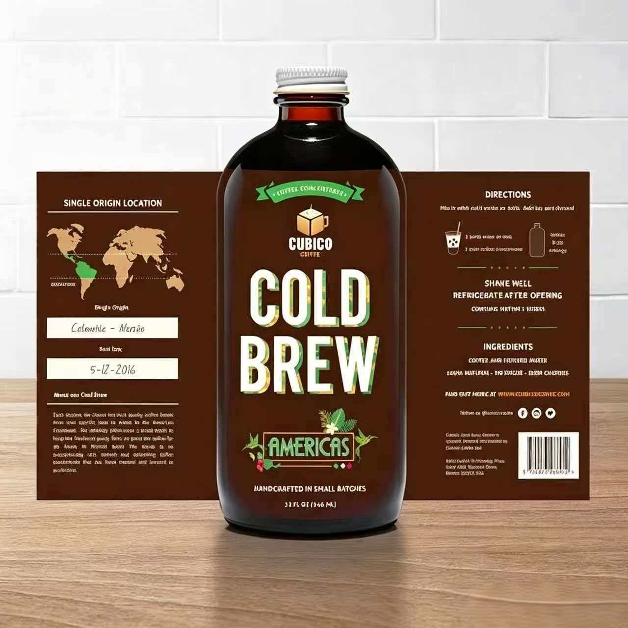
Metallic foil can make a small visual area more noticeable, but it should not be treated as a default choice. Ask the design team to identify the single element that needs emphasis. A restrained foil mark often gives the label a more controlled appearance than covering large fields with metallic decoration. It also creates a clearer quote comparison against a printed metallic color alternative.
Matte BOPP film is one option to assess when moisture resistance and a softer visual finish are required. Custom Panda offers wide substrate selection, BOPP lamination, UV resistant inks, and custom foil stamping colors. The right selection still depends on bottle handling and desired shelf effect. A paper based design may suit a dry, traditional presentation, while a film based construction may be a stronger candidate where bottle moisture is expected. Confirm performance on the actual bottle rather than assuming one material works for all storage conditions.
An Australia project illustrates how finish selection can be tied to a retail objective: metallic foil stamped roll labels for a natural health supplement brand combined matte BOPP film with scratch proof lamination for a premium retail shelf presentation. That was a specific supplement project, not a universal wine label recommendation. For wine, use it as a useful comparison point when bottles will face frequent handling and the desired appearance calls for a matte base with metallic detail.
- Use printed metallic color when the design needs a metallic impression but the purchasing target is lower decoration cost. Confirm whether the brand standard allows this visual substitute.
- Use limited foil coverage when a crest, logo, or vintage number needs emphasis at shelf distance. It is less suitable if fine foil text may become difficult to read.
- Use one varnish treatment when the purpose is surface consistency and the artwork does not rely on contrast. It is not the right choice for a design built around deliberate matte and gloss contrast.
- Use laminate only for a defined handling concern when scuffing, moisture, or repeated contact has been identified. Avoid adding it merely because it sounds premium.
For design teams assessing material options, clear custom BOPP labels can help frame a discussion around film constructions, while premium custom matte labels is relevant when finish is central to the brand presentation.
Use die choices and artwork planning to avoid avoidable spend
Conclusion: Keep the outer shape simple unless the contour is doing real brand work. This fits most core range wines where repeatable production and price control matter. It does not apply when a distinctive silhouette is a required part of a premium gift box, collectible release, or established brand identity.
A custom contour can distinguish the bottle, but it can also make artwork setup, die planning, and application more demanding. Begin with a rectangle, rounded rectangle, or oval as a benchmark. Then compare it with the desired custom shape at the same approximate label area. If the brand team cannot explain what the custom contour adds on shelf, the simpler shape is usually the better procurement option.
Separate fixed artwork from variable information
Wine programs commonly have repeated brand elements alongside changing varietal names, vintages, bottle sizes, or market text. Separate these elements in the artwork briefing. Fixed graphics can remain consistent across versions, while variable information can be managed as controlled variants. This helps prevent accidental use of outdated text and makes the quotation structure easier to understand.
Do not shrink mandatory text simply to preserve a decorative layout. First build the information area, then place the brand assets around it. This order reduces late artwork changes, which can trigger unnecessary proof revisions or force a label size increase after a die has already been chosen.
Common quote comparison mistakes
- Comparing total order prices only. Compare unit price, setup items, decoration, roll details, and shipping terms separately. A lower order total may omit a needed finish or use a different quantity.
- Leaving roll direction unspecified. This can create application problems if the finished rolls do not suit the bottling equipment. Confirm this with the line operator before approval.
- Ordering one large label for every bottle position. Front and back labels often serve different purposes. Separate specifications may reduce decoration where it adds little value.
- Approving color from an unverified screen. Use the photo or digital sample confirmation process, and share brand color references before production.
- Adding foil and varnish without a shelf objective. Each finish should have a stated role, such as drawing attention to a logo or differentiating a reserve range.
- Ignoring storage conditions. Cold bottles and condensation can lead to label failures when material and adhesive requirements were not stated in advance.
Build an RFQ that suppliers can quote accurately
Conclusion: Send a structured RFQ with application, artwork, quantity, and finish information in one file. This fits procurement teams seeking comparable quotations from several suppliers. It does not remove the need for a physical bottle trial when the packaging line or storage environment presents special conditions.
- List every SKU. Identify wine type, bottle size, front label, back label, neck label, and any limited edition version.
- Provide label dimensions. Include a dieline if available, or provide the bottle and target application area for review.
- State the print run quantity. Include first order volume and expected repeat volume if known. Ask for digital and standard bulk alternatives when both are viable.
- Specify the roll label configuration. State core requirement, unwind direction, labels per roll, spacing, and whether application is manual or machine based.
- Describe handling conditions. Include chilled storage, condensation, ice exposure, warehouse conditions, and expected retail handling.
- Identify the finish hierarchy. Mark which elements need metallic foil stamping, what varnish options are being considered, and which areas can remain standard print.
- Request a controlled proof. Review the photo or digital sample for text, artwork placement, and color intent before mass production.
- Confirm commercial protections. Custom Panda offers color mismatch free reprints, proportional replacement for defects, 5 day fast restocking or repair, and 100 bonus pieces with every bulk order. Confirm how these terms apply to the specific order before approval.
For broad roll format sourcing, see custom printed roll labels. Wine teams can also assess custom wine labels with gold foil when foil and embossing are being considered for a premium release.
Request a quote with your bottle sample details, quantity forecast, roll requirements, and finish priorities to compare the right specification options before production.